
6 key email programs to optimize before Q4
We’re a few weeks away from Oct. 1. Has your Q4 email marketing strategy planning kicked in yet?
Before you turn everything over to holiday campaign planning, take time now to review six email programs that run in the background but are just as essential to your email success as your holiday-themed campaigns.
I chose these email programs to optimize because they stay with your customers through their lifecycle with your brand, from acquisition to retention. They introduce customers to your brand and can shape how they perceive it. Others work to keep your customers moving forward on their journeys with your brand and make them feel appreciated and valued.
They can also bring in extra money on their own, keep customers on the buying path or bring them back to it, and build up exposure and recognition in the inbox. That will help your holiday emails get seen and acted on as inboxes fill up and fatigue sets in.
Your holiday emails are about to face a competitive deluge of Niagara Falls proportions. The time you put into auditing and optimizing these programs now will help those emails stand out as welcome visitors in the inbox – and that can help you reach your goals.
None of the email programs below will get you to your email goal by themselves, of course. But they could make it easier for you to reach the finish line before everyone around starts losing their minds in December and screaming down the hall for you to send another email.
1. Acquisition
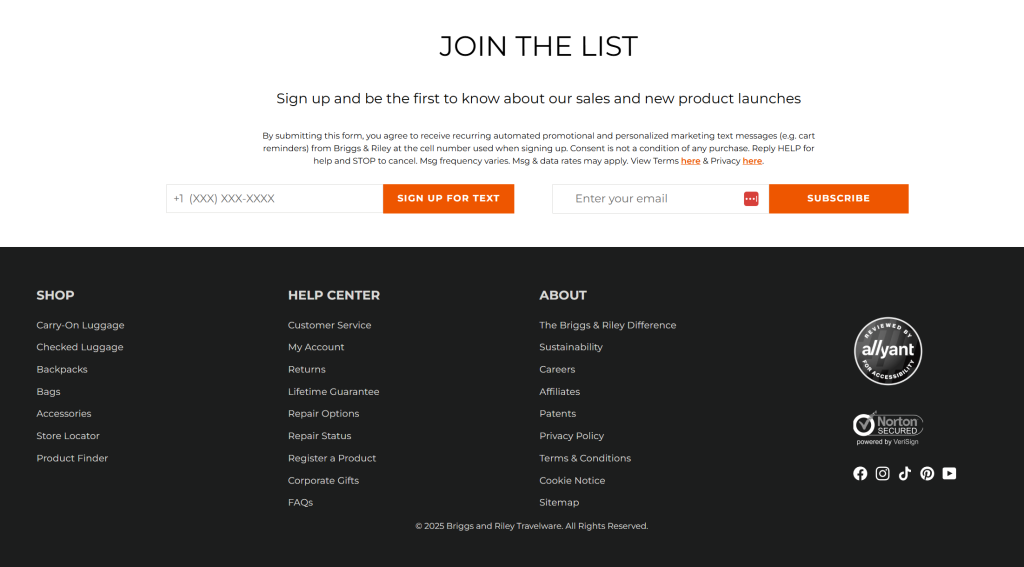
This email from Briggs & Riley Travelware puts the email opt-in at the bottom of the page. I hate that, but it’s common among retailers. Sometimes, it’s the only space the web team will give up. Or, they just don’t prioritize email acquisition.
But Briggs and Riley have made the most of a less-than-ideal location for these reasons:
1. Choices: They give customers the option to choose whether to sign up for texts or for email, or for both. I get annoyed when a retailer gives you a great incentive in exchange for your permission, but then forces you to choose both email and text. When you do that, you’re inviting customers to say no to you. Either they’ll bounce away and you’ll lose them, or they sign up and then opt out of the channel they don’t want.
2. Visibility and benefits: The opt-in section stands out from the promotional copy over it and the boilerplate below it. Its clean, streamlined format harmonizes with the general page design, while the orange call-to-action fields jump off the page to capture attention and explain the benefits.
3. Segmentation data: The opt-in choices give you data that identifies customer traits, which you can use to move them into segments and begin targeting your content right away.
Your takeaway: Study after study reinforces that when an acquisition form is up at the top, you get more registrations. Show how you can increase your acquisition rate with the acquisition form at the top. But if you’re stuck in the basement, make the best of it. Use strong benefit-driven copy, an easy-to-click opt-in button, and choices to make your messages as attractive as possible.
2. Welcome email 1: New customers
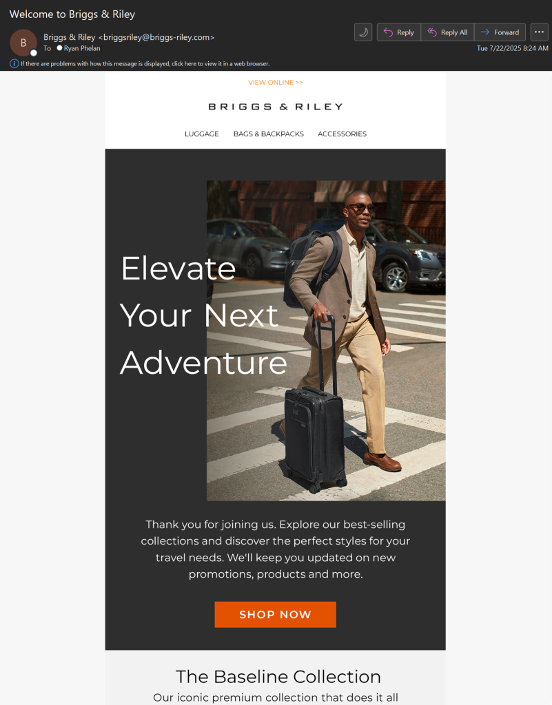
This Briggs & Riley welcome email (click to view larger) is another winner because the intentional choices of images and copy introduce the brand, which sells higher-end luggage and travel goods, with intentional copy and image choices.
Instead of spending space on the obvious, like “Welcome to Briggs & Riley,” the brand chooses the subliminally more appealing “Elevate Your Next Adventure.” “Elevate” signals that you’re not buying dollar-store-quality luggage. The image of someone hauling this pricey bag through the mean streets and not on the smooth surfaces of an airport concourse is another subliminal assurance.
Your welcome email is one of the most important emails you send to your new subscribers. It’s the first message they see from you in their inboxes, aside from a confirmation request if you use it. Your welcome email should meet these qualifications:
● Represent your brand well
● Look good on mobile
● Allow for images both enabled and blocked
● Say “Thank you”
● Include personalization
● Have brand statements
● Include any disclaimers
Welcome emails get high open and engagement rates. Deliver it within the first 2 minutes after opt-in, and you’re creating an excellent brand first impression.
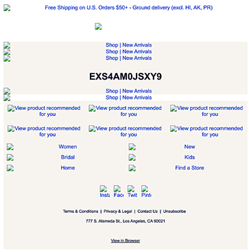
If you get it wrong, you’ll start your customer relationship on the wrong foot, and you might not recover. The email below is a welcome email I received from a retailer that apparently forgot that many Gmail and Yahoo! Mail users don’t enable images from brands they’ve never seen before.
Here’s how that email looked when I opened it:
Here’s a quick check-up for your welcome email:
o Does it convey a welcome, thanks, and appreciation?
o Does it introduce your brand value, look, and feel?
o Have you updated it in the last year?
o Do the links point to the right pages?
o Did you send it right after confirmation?
As part of your pre-holiday overhaul, you should audit and update this message, which is the first one your new subscribers will see.
3. Welcome email 2 – welcome to the app
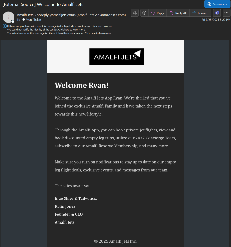
I’ve always believed that apps and email should work better together. This email from Amalfi Jets shows you how to do it.
This email (click to view larger) is appealing both for its simplicity and for its highly targeted message to a unique group: people who have downloaded and installed Amalfi’s app. It doesn’t need to spend the same time on brand-building and value proposition as a standard retail brand would.
That’s because it assumes people who download the app already have a grasp on the culture and the company story. They’re moving from “enthusiast” to “loyalty” status.
Sending a welcome via email gives the brand a little more space to tell its story. This email also lets you compare the value and impact of a message signed by the top person in the company – the CEO, founder, or face of the brand – as opposed to the Farmer’s Dog email above, where the message comes from someone you might interact with.
Your takeaway: This welcome illustrates the value of using email to tie your app and even your SMS channels together for a unified message. Also, your customers might be more receptive to these messages in email than they would for texts or app alerts.
4. Onboarding email series
An onboarding series expands on your welcome email and the story behind your brand. If you have to explain a process or gather data through progressive profiling, those messages usually go into your onboarding emails before you drop your customer into your regular promotional schedule.
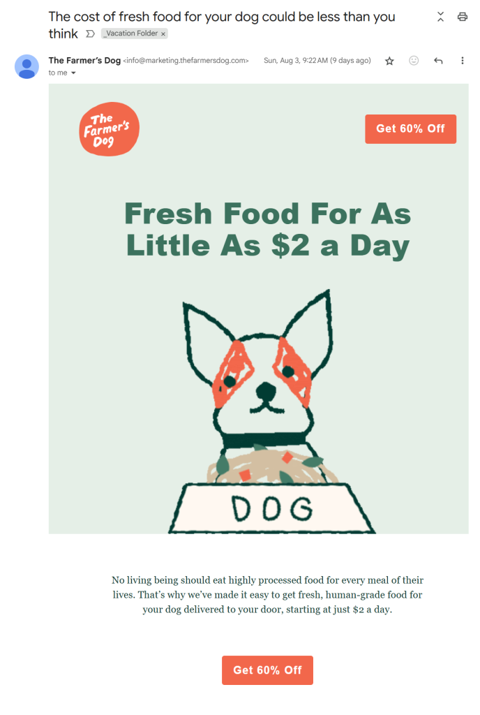
Here are two onboarding emails from The Farmer’s Dog, a subscription meal service for dogs. They go out to subscribers who haven’t signed up yet for the meal service. These two emails represent two important aspects of the onboarding process:
1. Quickly introduce the brand and begin building value.
I admit it. I’m a sucker for a cute dog animation. Here’s a close-up of the cartoon from Email 1:

I quibble with the image size – the dog image appeared big in comparison with the rest of the email – but it passed Gmail’s image weight test without getting clipped. But the email begins right away to build value for its expensive product – high-end fresh dog food. Or “food for your dog” as the brand prefers to call it. That’s another subtle branding play that the welcome email reinforces. It’s also a key aspect of onboarding email best practices.
This email (click to view larger) has one big goal: to persuade prospects to get over their objections to the total monthly cost of the service. The copy appeals to both bottom-line shoppers (“… starting at just $2 a day”) and to the emotional bond between dog and owner (“No living being should eat highly processed food …”). Also, the brand puts the deal in the CTA, which helps it stand out to emotional and bottom-line shoppers alike.
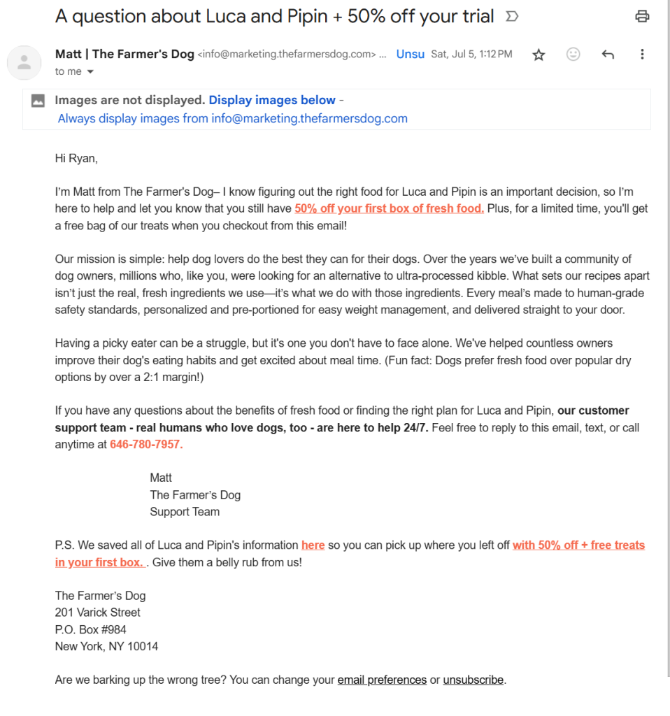
2. Build out the story.
Email 1 launches the value-building process. Email 2 (click to view larger) builds on the objection-softening opening email and incorporates details about the prospect’s dogs gathering through the account registration process, such as names, eating habits, and more.
The letter format is a great follow-up. Maybe it’s the psychological shift of progressing from the image-heavy whimsy of Email 1 to the personal and personalized feel in the second. Or that it comes from a person (Matt from Customer Support).
A message from the CEO or company founder might have had more human-interest impact, but sending it from “Matt” puts a human face on the support team that I might have to deal with if I were to sign up.
Your takeaway: The onboarding series has broader business goals than your welcome email. It expands on your brand story and guides your newcomers to take the necessary next steps to conversion.
You can use it to start gathering information for segmenting and targeting future promotional emails, too. The more complex your products or services, the more onboarding emails you might need to send. Testing can show you how many emails you might need to send before customers move to act.
Would adding one more email to your onboarding series help you? That’s a question to answer and test now.
5. Transactional emails
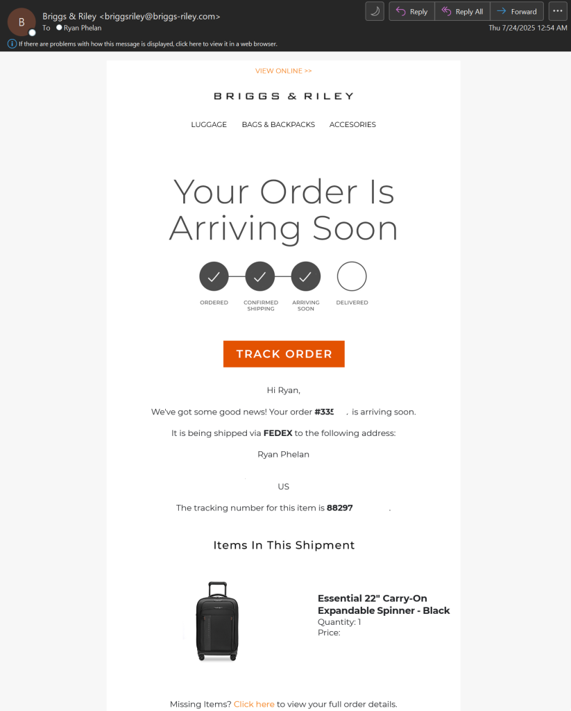
Back to Briggs & Riley and a transactional email I love for its combination of simplicity and detailed information (click to view larger). Emails like this are why customers love transactional emails.
This email is the last one I received before my purchase landed on my doorstep. The progress chart at the top, the “Track order” CTA, the quick-to-view copy, and the product image told me everything I needed to know at one glance.
Do yours tell your customers what they need to know to trust you with their purchases and intimate financial and personal information? Or do you go into radio silence as soon as you confirm the sale?
Your takeaway: Here’s a quick check-up for your transactional emails:
o They represent the brand well
o The information is displayed clearly and concisely
o The email is informative and comprehensive
o It cross-sells and upsells to other categories, including complementary and next logical products
Transactional emails don’t just say, “Thanks for the order.” They also say. “Here’s what you bought, what you paid, when you can expect to get it, and how to reach us if you have a problem.”
Beyond these basic requirements, your transactional emails can try to bring in follow-up sales. This Briggs & Riley email could have added a small bonus sales section to promote comparable products like packing cubes. I also wish the FedEx tracking number (obscured for privacy) had been hyperlinked, but the “Track Order” button got me there eventually.
Transactional emails reach customers when they are most likely to buy again. If you don’t already add cross-selling or upselling to your transactional email, try a quick test now. Your sales data can help you find products to test. Some retailers make 50% of their email revenue from triggered and transactional emails, and add-ons like these are part of how they do it.
6. Welcome back
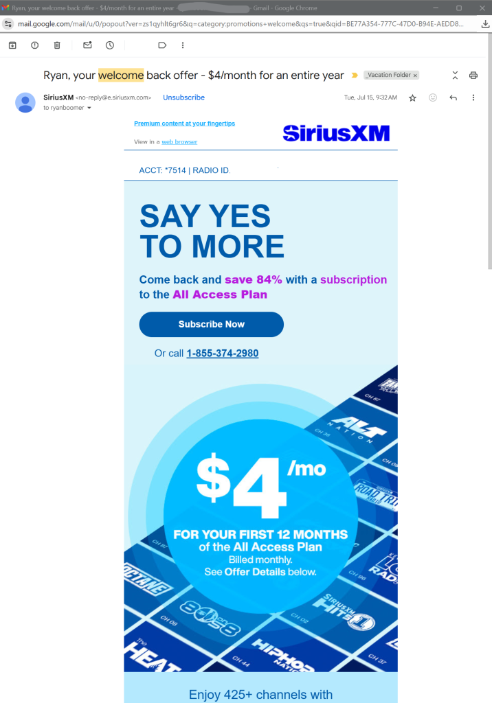
When lapsed customers return to your email program, they don’t need to go through the same welcome and onboarding programs that new customers get. Instead, a “welcome back” email like this one from Sirius XM can be a new and more fruitful take on the classic reactivation email.
This email (click to view larger) is all about the money: $4 a month for a year. It’s in the subject line and the hero image. The discount – 84% – is in a contrasting type color. There’s little distracting fine print, unlike many reactivation emails that hedge their offers with lots of conditions and exclusions.
If you send a standard welcome to these returning customers, you’re just inviting them to start ignoring your emails sooner. A welcome and onboarding series that reminds people how to use your service, what you’ve added since they left, and repeated reminders about the benefits of staying will be more useful.
Your takeaway: Reactivation emails take careful handling. First, you have to be sure you’re sending them to the right customers. A subscription service is easy to track. Just pull a list of people who canceled their services. It’s trickier if you’re trying to reach customers who just stopped buying and faded away.
For holiday shoppers, reactivation emails can be tricky because you don’t have an obvious demarcation between active and inactive customers. Do they shop only once a year, at holiday time? Were they regular customers who went over to your competition? Do they still buy from your brand even though they don’t open or act on your emails?
As I mentioned for subscription services, your reactivation emails shouldn’t simply reiterate your regular welcome email. Instead, tailor your messages for your different reactivation segments and send a general “welcome back” to everyone else.
Wrapping up
Email is not “Set it and forget it.” Email is “Set it and keep improving it.”
These emails are the foundational elements of a successful email marketing program. They’re essential for growth and new revenue but are easy to overlook. You spend hours poring over your promotional emails. These messages deserve just as much attention.
What can you do to make your email program smarter and more efficient? Make room in your Q4 email marketing strategy now to review these email programs and optimize them for value, accuracy, and usability.
Recent Comments